While having top-notch visual merchandising and eye-catching window displays attracts potential customers to your store in the first place, your retail checkout counter is the heavy hitter in turning prospects into paying customers. Not only is this your final shot to make an impression on your customers, but it’s also your last opportunity to put your employees’ suggestive selling to work.
Your checkout counter is more than just a place to swipe or tap credit cards; it’s a major selling opportunity. Whether it’s training your staff on cross-selling techniques, or revamping your set up, this post has you covered.
We’ll take a look at the ways to make the most of your retail checkout counter experience.
- Take note of the available space you have
- Know the different types of cash wraps in retail
- Make it eye catching
- Opt for health and safety
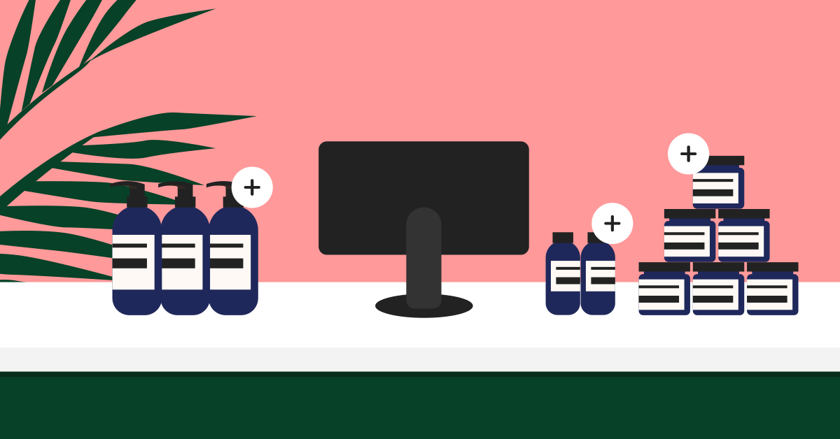
- Use your checkout line as a shopping alley
- Train staff on suggestive selling
- Add frequently bought accessories to your counter
- Personalize the experience
- Simplify your checkout process
- Provide useful solutions
- Make a statement
- Give people the chance to browse your products
- Add a TV screen behind you
- Add a bit of “you”
- Invest in great lighting
- Add a plant
- Encourage social shares
- Have something seasonal
- Promote your CSR efforts
- Use a sleek and modern POS system
Tired of manually managing your inventory?
Create unlimited unique barcodes for your inventory today with our free barcode generator tool. It's easy to use and compatible with all scanners.
1. Take note of the available space you have
How much space do you have to work with and how does the cash wrap fit into your store layout? When it comes to store layout and traffic flow in places like the US, your cash wrap should ideally be on the left side of the store, towards the front. Most American customers turn right when they enter a store, and you want your best selling items in the back, creating the longest path through the store.
(Note: The flow of retail traffic within a store may be different for merchants in the UK or Australia, so be mindful of this when setting up your cash wrap.)
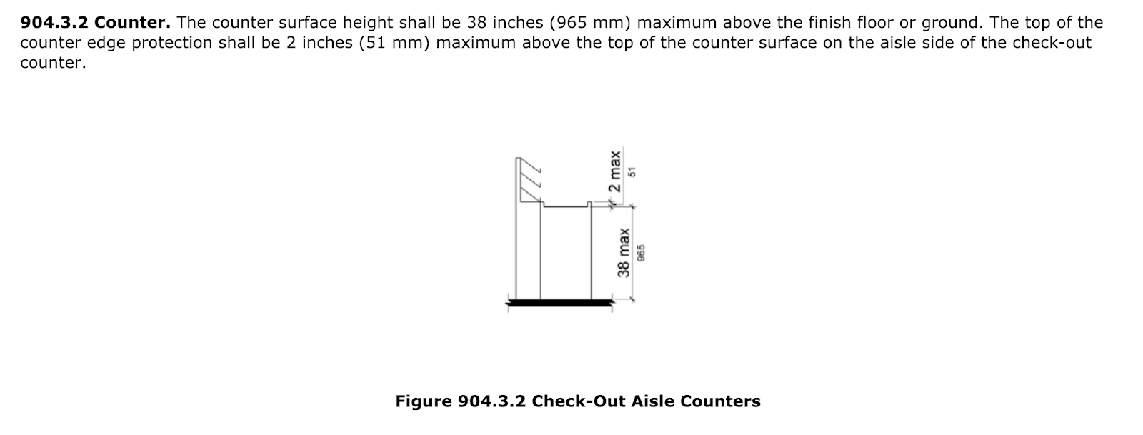
Make sure you keep enough space in front for customers to check out, while keeping enough space behind the cash wrap for employees to easily work. A good reference guide is the ADA Standard for Accessible Design, which mandates retailers have an area of at least 30 to 40 inches in front of the checkout counter, which will allow for a wheelchair.
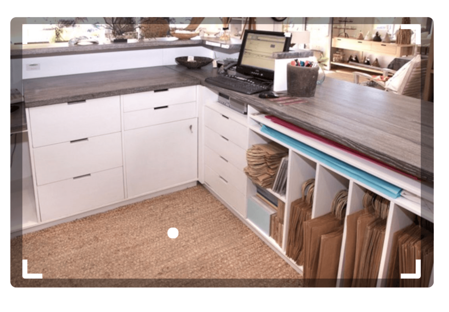
You’ll also need storage for any bags and all the materials employees will need to check people out. The more organized this area is, the shorter the wait time will be for customers.
2. Know the different types of cash wraps in retail
Not all cash wraps are created equal, so have a think about the best checkout counter configuration for your store. The “right” cash wrap type will depend on the amount of space you have and your objectives.
The three most common cash wrap configurations are:
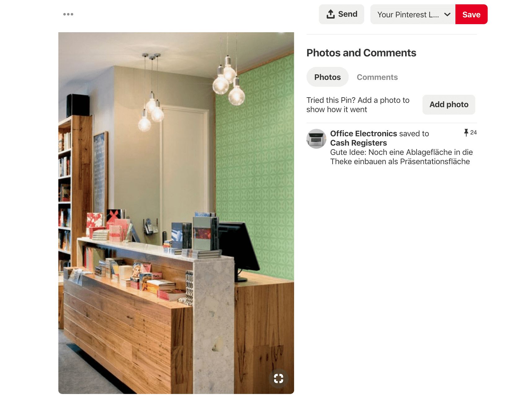
Single countertop / checkout counter
With this setup, your cash wrap consists of a single checkout counter. This is usually positioned parallel to a wall and takes up the least amount of space, making it ideal for small shops.
Dual cash wrap / two-part unit
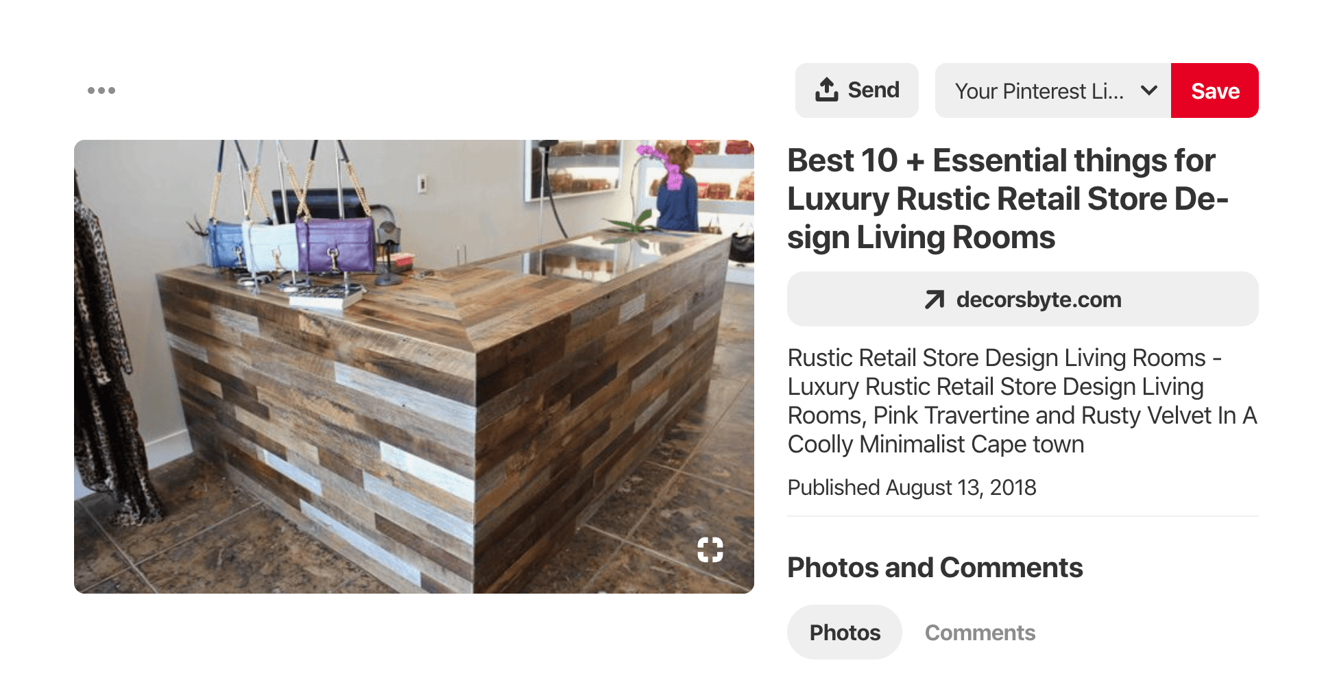
According to Palmer Retail Solutions, a dual cash wrap has “one section parallel to the wall and another free-standing unit placed in front, facing the customer.” This cash wrap works great for medium to large stores that need extra space for countertop merchandise.
Three-part cash wrap
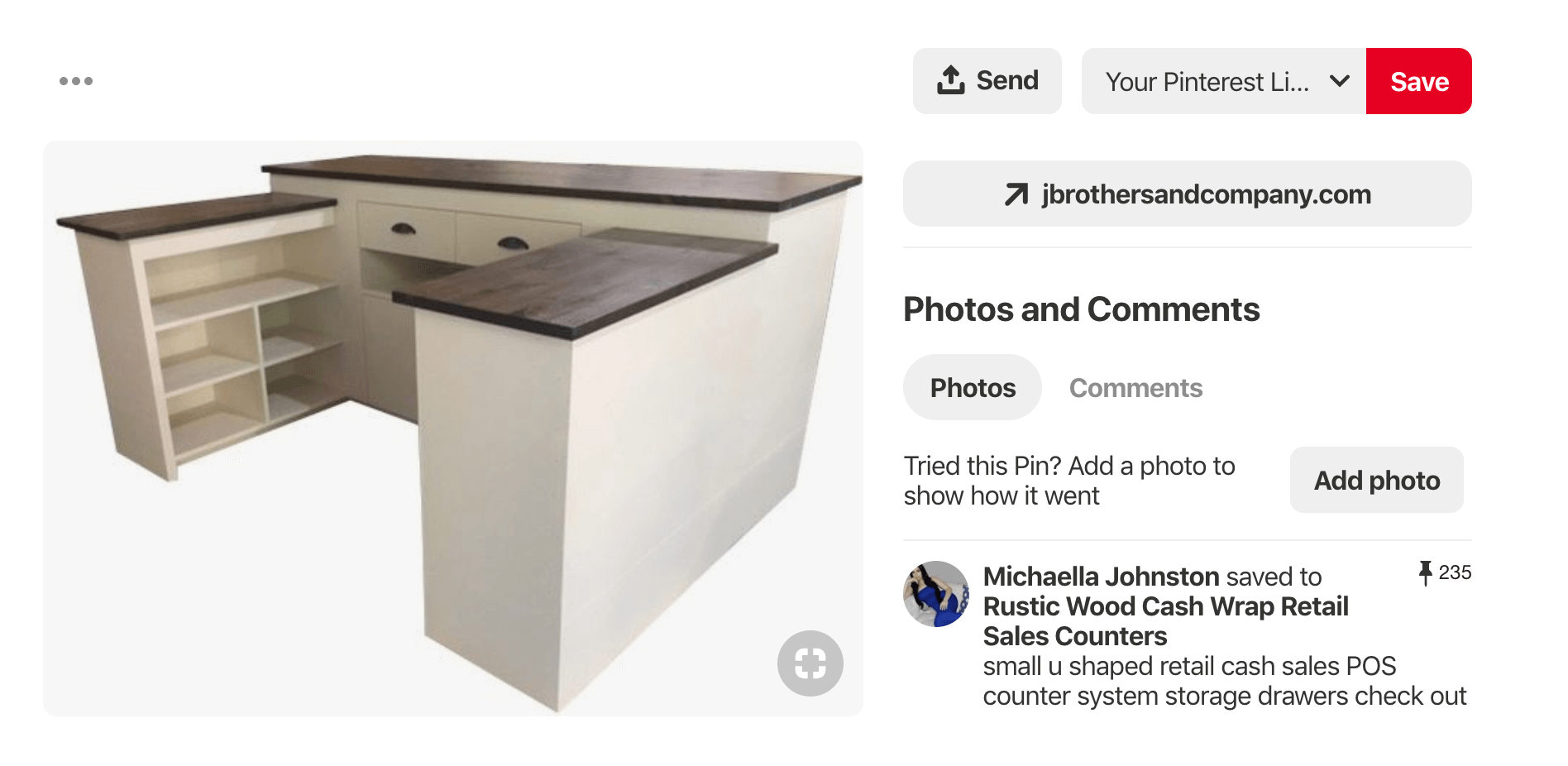
This configuration forms a U-shape around your cashiers, and it’s ideal for high-traffic stores that require multiple people at the checkout counter. If you perform other customer-facing tasks at the checkout area (e.g., gift wrapping, order processing, customer support), then a three-part cash wrap is your best bet as it gives you ample countertop space to perform a variety of jobs.
3. Make it eye catching
While you do want your customer to spend time browsing around your store, ultimately you want them to convert and become paying customers. Having the right products combined with great customer service will help get customers to the finish line, but your checkout counter design could help define the last stretch of the customer experience.
Whether it’s showcasing a statement piece, keeping it simple or offering a mobile checkout experience, how you design the checkout counter and where you place it is critical to the flow of your store and the customer journey.
Feeling crafty or imaginative? Then let your creativity shine through to your cashwrap. You’re already getting creative with your window displays and store fixtures, so why not let your checkout counter get in on the fun?
Here’s a great example of a checkout counter that serves as a work of art at the same time:
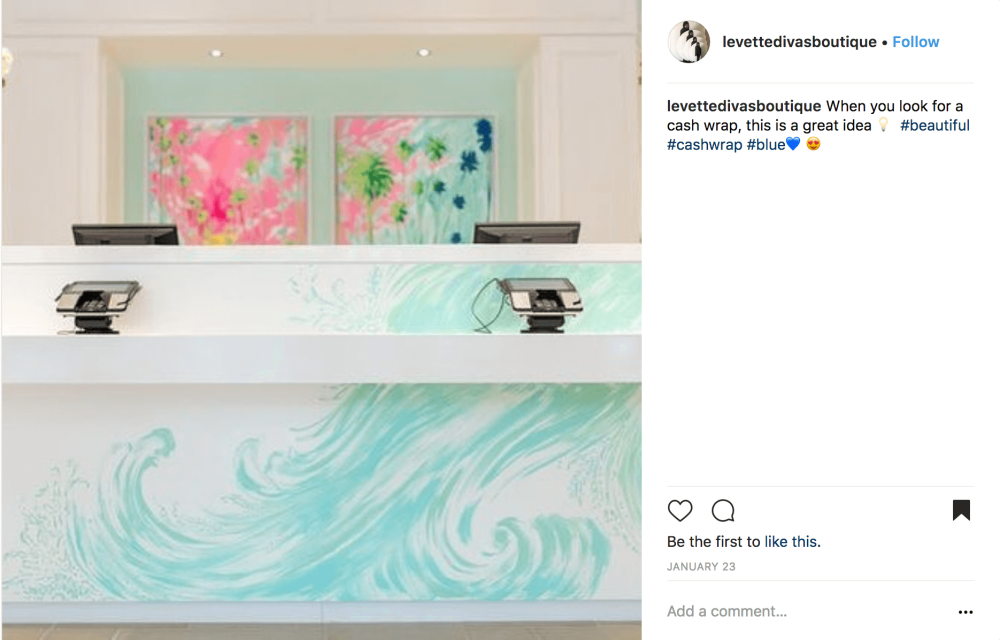
credit: levettedivasboutique on Instagram
Keep it simple
Eye catching doesn’t need to mean distracting. Going the minimalist route might be a great option depending on the interior design of your store. Opting for a simple checkout counter design, with striking elements that highlight key features such as beautiful imagery or art, your store name, specific accessories or just having your modern point of sale on display is a great inviting alternative to crowded checkout counters.
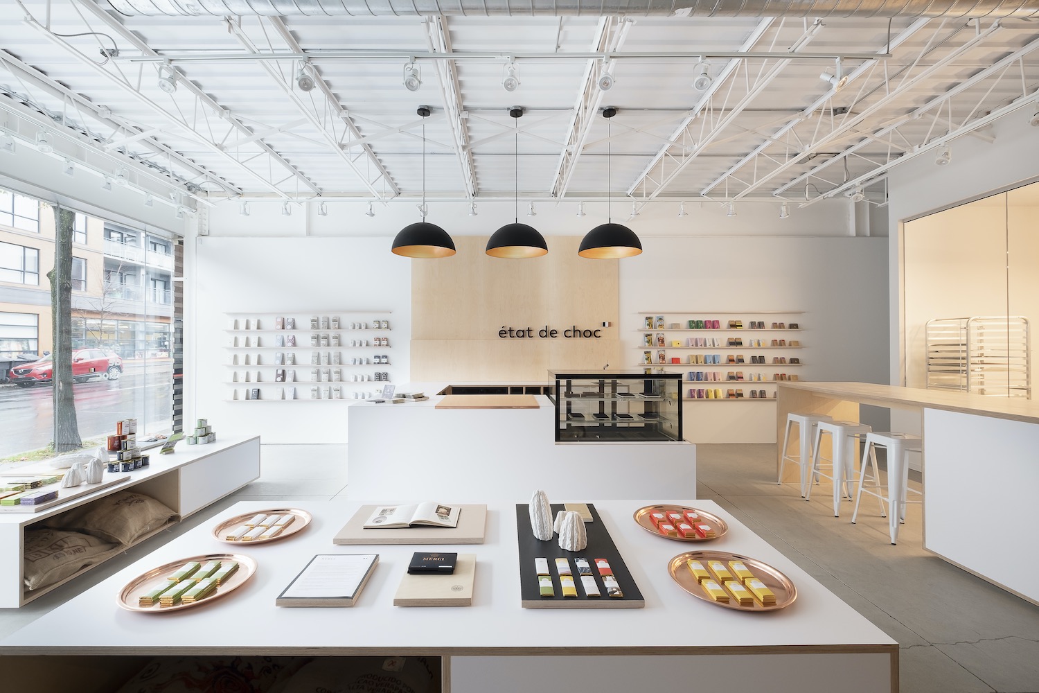
Take Lightspeed customer État de Choc for example. Their minimalist, showroom style concept lets your eye navigate easily around the room, eventually drawing your focus to their checkout counter wall, decorated with a simple yet eye-catching backdrop highlighting their store name and additional products.
Make it mobile
While most checkout counters are confined to a specific space within the store, some refuse to be limited to one specific area and are opting for more mobile concepts.
Take Apple, for instance. Its minimalist open-concept allows its entire store to double as a showroom experience and also a mobile checkout counter without physical boundaries.
Apple employees can take orders wherever the customers are, giving customers more control over the experience. Rethinking how you visualize your checkout counter can be a creative way to serve customers in the new era of retail.
4. Opt for health and safety
Health and safety has taken on a completely new meaning since 2020. Customers are likely to be more aware of health and safety going forward, even after the pandemic has passed, as they’ve grown accustomed to detailed information around sanitary practices and hand sanitizers at every corner.
These days, it’s essential to show customers the measures you’re taking to help ensure their safety as they visit your store. Whether it’s informing them via email before they visit your store or listing the guidelines you’re following in a sign placed at the checkout counter, these actions speak volumes and help build trust with customers and their new preferences.
And since the in-store checkout experience is likely to leave a lasting impression on your customer, it’s also an opportunity to showcase how you not only care about their experience, but also about their overall safety.
Some ways to help ensure you’re following health and safety guidelines in your store include:
- Social distancing between employees and customers and between customers at the checkout counter
- Adding plexiglass at the checkout counter
- Requiring proper masking and offering free masks
- Adding hand sanitizer at the checkout counter
- Offering contactless payment options
5. Use your checkout line as a shopping alley
Your checkout counter is your final physical touchpoint with customers, but how they make their way to the cash register is also a key opportunity to make an additional sale.
Surely you’ve seen how some stores use the checkout line as the ultimate selling opportunity, lining it up with products and luring customers to make additional purchases as they wait in line.
While grocery stores have traditionally used product-lined checkout lines, more and more retail stores are adopting this strategy to organize lineups and also entertain customers with more shopping opportunities.
These types of checkout lines help corral customers while also giving them plenty of motivations for impulse purchases. With the average monthly spend on impulse purchases increasing 18% in 2020, to $182.98, now’s the time to create new opportunities for your customers to shop.
As a brick-and-mortar store, you’re in a great position to encourage impulse buys, and your checkout counter is one of the most natural areas in your store to do this. People who’ve made it to the checkout line are obviously in the mood to buy, so positioning the right merchandise can help boost their basket size.
What are the best impulse buy items?
Generally speaking, the best impulse buys are small and self-explanatory. As business consultant Lynn Switanowski told ABC News, “Such products don’t need a lot of explaining. It sells itself (because) you understand what it does.”
Depending on your store, you could consider displaying the following items at checkout:
- Gift cards
- Travel-sized version of existing products
- Accessories to compliment your core merchandise
- Seasonal products (e.g. holiday cards, gift items)
- Food and drink
- Small toys or kids’ products
- Practical items like car chargers
Whatever you decide, make sure those impulse items are on brand. For example, JapanLA, a shop that features Japanese Pop Culture toys, gifts, and apparel, displays nifty items like lipsticks and stickers at the checkout counter.
What’s great about them is that they’re not just any old lipsticks or stickers. Just like the rest of JapanLA’s products, these impulse buys fit in with the Japanese pop culture lifestyle that the store promotes.
6. Train staff on suggestive selling
Just because your customer is getting ready to pay, doesn’t mean you’ve run out of time to sell them on additional items. Your checkout counter can also be the perfect place to implement some suggestive selling techniques to upsell or cross-sell.
However, there should be a strategy as to how you implement this at the checkout counter. You wouldn’t want pushy staff to dissuade customers from finalizing the purchase in the first place!
Set up training sessions with your staff to review specific styles of suggestive selling. Take this time to also educate them on your products and the respective complementary products that customers might not even have considered purchasing.
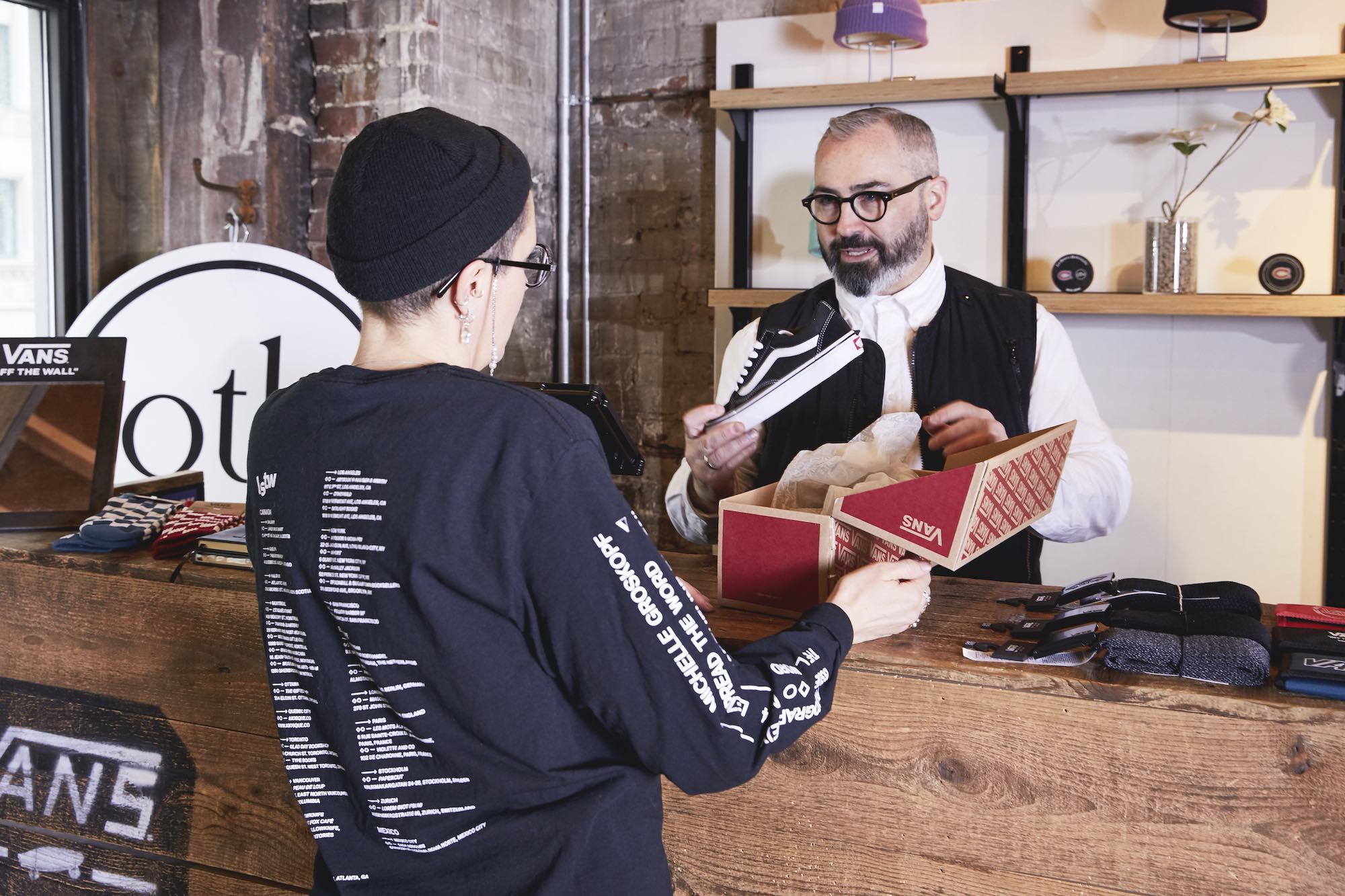
The checkout process might be the best place to bring up additional items that complement the product your customer is buying, or even suggest alternatives or better options that might fit their needs. This is a great time to start a conversation with interested customers about why they’re purchasing the product to see what fits their needs.
The bottom line is that, while there’s certainly a financial incentive to increase the final basket size of your customer, suggestive selling should also be about improving the final shopping experience and offering customers options that might improve the end product.
Ultimately a win-win for both store owners and customers.
7. Add frequently bought accessories to your counter
One way to help your employees make an additional sale is to showcase popular complementary products at the checkout counter. Having them close at hand makes it easy to quickly show customers the benefits and add it to their basket.
While you might have already stacked up your checkout line with products, you can leave your final best-selling accessories for the cash register. Make sure to choose accessories that complement your main products and are small enough to fit on your checkout counter or can be displayed in a decorative way in the wall behind the cash.
This way, your employees will be able to easily start a conversation with customers around these additional products, without having to go search for products and risk losing the customer’s interest.
Choose products strategically
But wait! This doesn’t mean you should be filling up your checkout line and point of purchase displays with products, creating clutter that will dissuade customers instead of persuading them. Being creative and efficient with your checkout counter means being strategic with the products you decide to showcase and how you place them.
Think of those products that customers are constantly looking for, or might often forget to buy. Since your counter space is likely limited, you also need to think of the size of those products and which ones might fit best. If you’re a golf course pro shop for example, you could make sure to include small accessories like golf tees, eyewear, umbrellas or even sunblock.
To make the best choices for your checkout accessories, make sure you back it up with data by looking at your analytics and reporting tools on your point of sale.
8. Personalize the experience
Customers want to feel that they’re special. So much so that 71% of consumers end up feeling frustrated when their experience is impersonal. And while it might prove difficult to remember customers’ faces or names when you have different employees and many customers walking in and out of your store, there are ways to keep track of customers and their preferences.
If you’re a smaller store with long-time employees, odds are you have a few regular customers that your staff can easily recognize and cater to their specific needs. But even so, with so many things to manage, it’s key to have written data you can count on to help you remember customer history to offer a more personalized experience.
By having a loyalty program, you can easily keep tabs on customer spending, the type of products they bought, even special days like birthdays or anniversaries and their overall preferences. This way staff can take a look at their customer profile and be able to serve up a better experience at the checkout counter.
Even simple things like asking about a previous purchase or letting customers know that a specific brand they usually buy has new items in stock or coming up will show customers that you’ve put some interest in them and see them as more than a dollar sign.
9. Simplify your checkout process
Nobody likes a lengthy checkout process. Whether it’s a crazy long lineup or an overly complicated process to finalize a purchase, customers will leave as quickly as they arrived if they feel they might have to wait a long time to buy.
While it’s almost impossible to never have a lineup, there are many ways you can reduce wait times and make the checkout process as simple as possible.
Opt for customer-first checkout experiences
First things first—the reality is that you might always have customers that will come in with more complex requests. One way you can reduce wait times is to funnel customers with bigger requests like returns or specific customer service concerns to another counter in your store. This will free up your checkout counter for regular transactions and ensure you have specialized employees dealing with more complicated concerns or requests.
Next is adding a layer of mobility to your checkouts. While you might have only one checkout counter, with the right tools you could have a mobile checkout process to help your employees quickly process transactions for customers waiting in line or around the store.
By having options like contactless payments that let you offer fast mobile transactions, you can meet customers where they are and ensure their purchase can be finalized as quickly as a tap of a card. This also goes for stores offering things like curbside pickup, where they can meet customers outside and facilitate the payment experience.
Finally, a great way to keep your checkout counter organized and lineups low is to offer appointment shopping. This not only helps make sure your store is complying with the maximum number of customers allowed inside due to health and sanitation guidelines, but it’ll also help your staff prepare for their visit, ensuring that your customer is getting more personalized attention and ultimately creating a quick and seamless experience at the cash register.
10. Provide useful solutions
How many times have you gotten to the front of a checkout line only to realize that you forgot to pick up something simple, yet important? Here’s the chance for retailers to stock products that customers don’t usually think about buying, but that they actually need.
What you choose to stock here will depend on the kind of products that you sell in your store, but some general questions to ask include:
- What small products do customers often ask for help in finding?
- Do salespeople get asked about certain smaller items on a regular basis?
- What items does your target customer often need, but might not think to buy?
- Are there small, trial-sized versions that can turn into easy, useful add-ons?
- Are they any small items that can complement your current assortments?
Check out this example from House of CB in West Hollywood, CA. Their cash wrap is filled with accessories such as backless pads, adhesive cups, and covers which serve as perfect additions to the many strapless and backless clothing that the store sells.
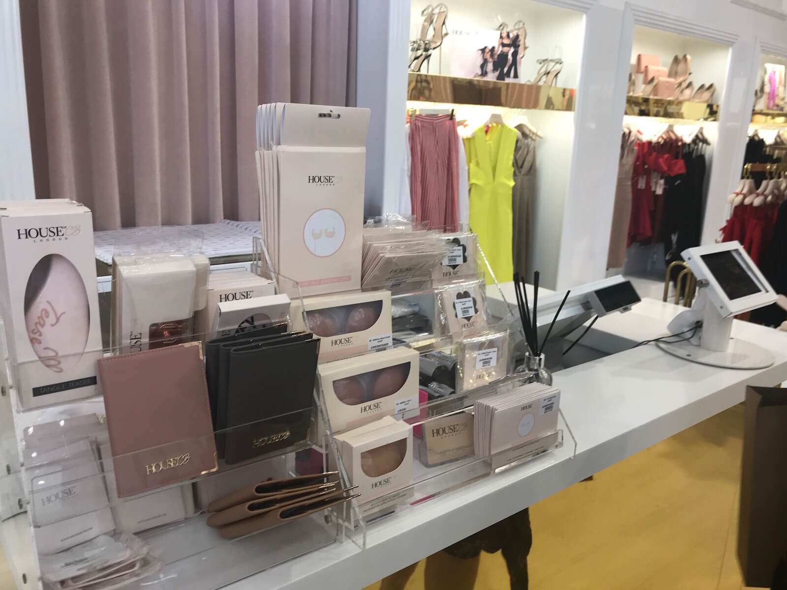
House CB also has a number of gift cards on its cash wraps to further drive sales.
Speaking of which, regardless of your niche, one item that should always be placed at the cash wrap is gift cards. Simply seeing these on display can help a customer to remember an upcoming event, birthday, or occasion they need a gift for.
11. Make a statement—literally
Display a witty remark on your cashwrap. A compelling statement at the checkout area can serve different purposes, including:
- Showing off your brand’s personality
- Making your customers laugh or feel more connected to your brand
- Reinforcing the things that make your products great
- Boosting the look and feel of your checkout area
View this post on Instagram
The above is a cool example from Staghorn Mercantile, a nurseries and gardening store in Oregon. Staghorn has the sentence “Because plants are cheaper than therapy” written on the front of its checkout counter, and does a great job at marketing the store’s products while keeping the cash wrap area looking fresh and engaging.
12. Give people the chance to (digitally) browse your products
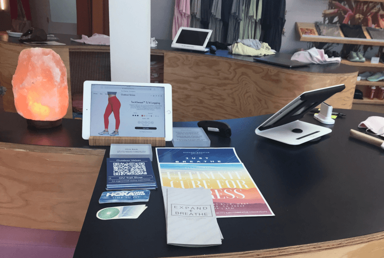
If you have an ecommerce site and don’t carry every single SKU in-store, give shoppers the ability to browse the rest of your catalog. You can easily to do this by giving your associates tablets that they can use when interacting with shoppers.
As for customers who prefer to browse on their own? Put tablets on checkout counter area so customers can explore your online shop. Here’s a great example from activewear retailer Outdoor Voices:
13. Add a TV screen behind you
Television screens not only enhance the look and feel of your store, but they can also heighten the shopping experience. You can use TV screens to reinforce your brand and products. Let’s say you’re an apparel retailer. Why not air a slideshow exhibiting your latest look designs?
In some cases, TV screens can be used to entertain customers. JapanLA, for example, has a video of adorable cats playing on loop.
The wall behind your checkout counter is one of the best places on which to install your TV. It’s a prominent section of your store, so you can pretty much guarantee more eyeballs. Plus it gives your customers something to look at while waiting for their turn at checkout (see the photo of JapanLA’s checkout counter above).
14. Add a bit of “you”
Use your checkout space to show off your personality or story. Fancy fixtures and decorations are great, but having something uniquely “you” on or around your checkout counter will give shoppers a glimpse of who your are what you’re all about. That’s the type of thing that encourages connection and memorability.
So, use your shop’s checkout section to tell people about yourself or your business story. Maybe you can put up photos from when you were just starting out. Or, if your business has any press mentions, you could put up those magazine articles up on your checkout wall.
Have a look at this great example from Lynn & Barrett, a mother-daughter owned clothing boutique, which has portrait drawing of the owners hanging in their checkout area.
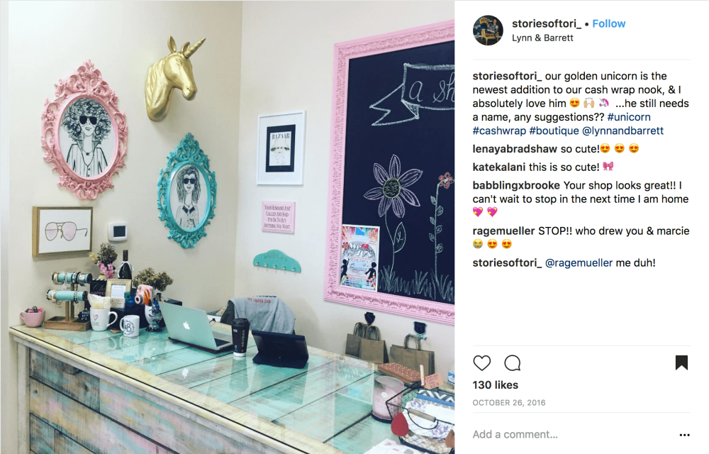 Credit: storiesoftori_ on Instagram
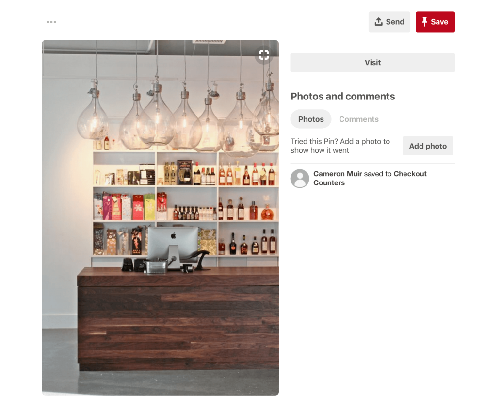
15. Invest in great lighting
Your checkout counter needs to be well lit, so why not invest in lighting that’s beautiful and functional at the same time? Bold lighting fixtures right above your cashwrap can draw attention to your checkout area while enhancing your overall in-store design.
16. Add a plant
Looking for a quick and inexpensive way to spruce up your counters? Add plants.
They’re easy and affordable to maintain, and they can instantly breathe life into your checkout area.
Empire Homewares in Australia is a master at using plants in-store. Check out their photos below, and notice how they use planters to enhance their checkout counter (and various other space in the shop).
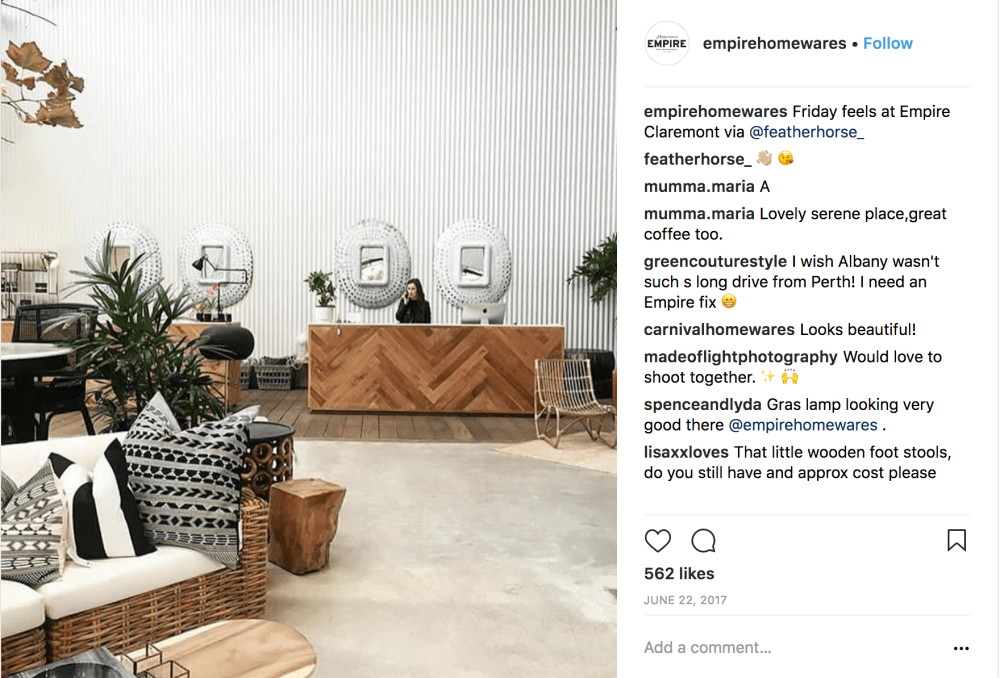 Image credit: empirehomewares on Instagram
17. Encourage social shares
Social media is an integral component of retail marketing. In addition to creating content in-house to post on social, we highly recommend encouraging your customers to share images of your products and store.
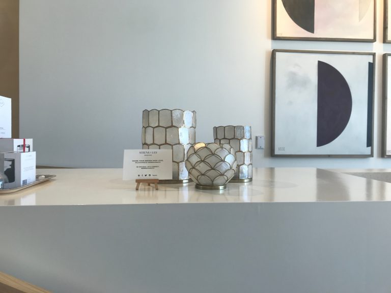
You can accomplish this by displaying your social media handle and brand hashtags inside your fitting rooms and — you guessed it — your checkout counter.
Put up a sign reminding people to connect with (and talk about) your brand on their favorite social channels. Doing so will help increase your followers and potentially put your brand in front of wider audiences.
Below is a great example from Serena & Lily which says:
Share your design shop love. #SLLOSANGELES #SERENAANDLILY
Be sociable. Let’s connect.
@SERENAANLILY
18. Have something seasonal
Make sure the design of your checkout counter doesn’t stay static all year round. Keep things fresh by incorporating seasonal elements whenever relevant.
For example, if it’s Valentine’s Day, you could spruce it up with hearts or flowers. Or, if it’s the holiday season, why not put a small Christmas tree on top of your counter or hang some stockings in front of it?
Take a look at this beautiful example from Beacon Home Goods:
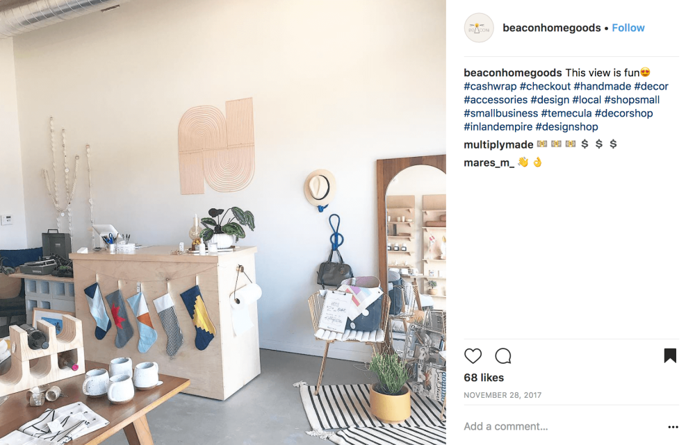 Image credit: @beaconhomegoods on Instagram
19. Promote your CSR efforts
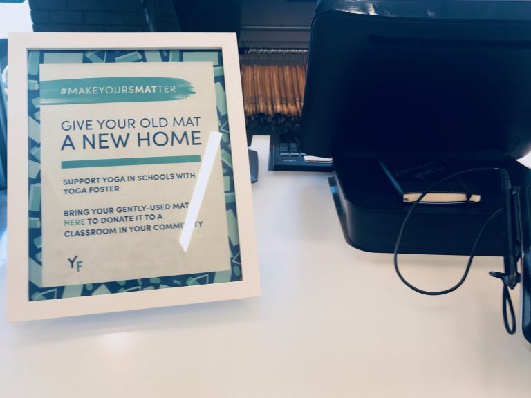
Engaging in corporate social responsibility? Use your cash wrap to promote your efforts. Having a simple sign telling shoppers about your charitable initiatives can help your cause. It also reminds customers that you stand for social good, and this, in turn encourages loyalty and increased spending.
One retailer that’s doing this well is Lululemon. In its West Hollywood location, the activewear retailer has a small sign on their checkout counter reminding people about their #MakeYoursMatter initiative.
20. Use a sleek and modern POS system
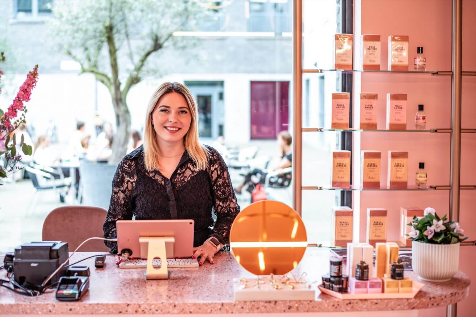
It’s not just about the merchandise on your cash wrap. The POS system you use can also make a statement. A clunky cash register may communicate that your business isn’t keeping up with the modern needs of shoppers. And depending on your brand, an unattractive POS or register may go against the image or style that you’d like to convey.
So, see to it that your POS looks as good and shiny as your store. This could mean using iPads and handheld devices that don’t clutter up the cash wrap.
On the other hand, if you need a larger display or additional equipment, adopting a POS system that works well with laptops and modern computers is a good way to go.
For best results, use a point of sale solution (like Lightspeed) that works on a wide range of devices. This ensures that you have a POs that works well, regardless of your tech preferences and needs.
The right tech sidekick for your checkout counter
However you decide to set up your checkout counter, you need to make sure you have the right tools working alongside you.
When it comes to technology, your point of sale could be your biggest ally or your worst enemy. Whether you’re checking inventory levels or searching through a customer’s purchase history, you’ll need a POS that will work with you when the lines start piling up and the customers are waiting.
To find out more about how a cloud-based point of sale like Lightspeed can get you out of a jam when store hours get busy, contact one of our experts. Watch a demo of Lightspeed today!

News you care about. Tips you can use.
Everything your business needs to grow, delivered straight to your inbox.

