
No matter what specific industry your eCommerce store operates within, one fact will always be true: There will always be questions customers ask that you’ll find yourself answering time and time again, like what your shipping costs are or what your return policy is.
While you can place these answers in different locations on your site, that’s not the most user-friendly option. You need to centralize all of your customers’ most frequently asked questions on a FAQ page.
A comprehensive FAQ page will assure that customers find answers to queries quickly and independently, meaning that you spend less time answering the same questions over the phone.
In this post, you’ll learn the following:
- What a FAQ page is
- When FAQ pages are useful
- Where FAQ pages should be featured on your website
- How you should answer frequently asked questions
- A standard FAQ page template
- Tips for building FAQ pages
- Examples of standout FAQ pages
Let’s dive in and get you on the fast track to knocking your FAQ page out of the park.
Learn how to bring your retail business online
Becoming an omnichannel business means you’re ready for whatever life throws at you—from extended store closures to evolving customer expectations. Learn how to bring your products online and start selling fast with our free quickstart guide.
What is a FAQ page?
An FAQ is a list of “frequently asked questions” and their respective answers. An FAQ page can be a core page on your site that lists common questions and answers that you think your customers will have.
FAQ Pages can be as long as short as you want. Some brands may only feature five questions, while others have dozens or even hundreds of questions broken down into distinct, carefully-organized sections.
When is a FAQ page useful?
FAQ pages are useful if there are standard questions that your team is asked often. Even if the information is implied or is available somewhere else on your website, if they aren’t aggregated in a single location, shoppers risk not finding that information.
As consumers, we can all relate to not finding detailed product information, return policies or shipping information and abandoning our cart as a result. That’s the problem that FAQ pages aim to solve.
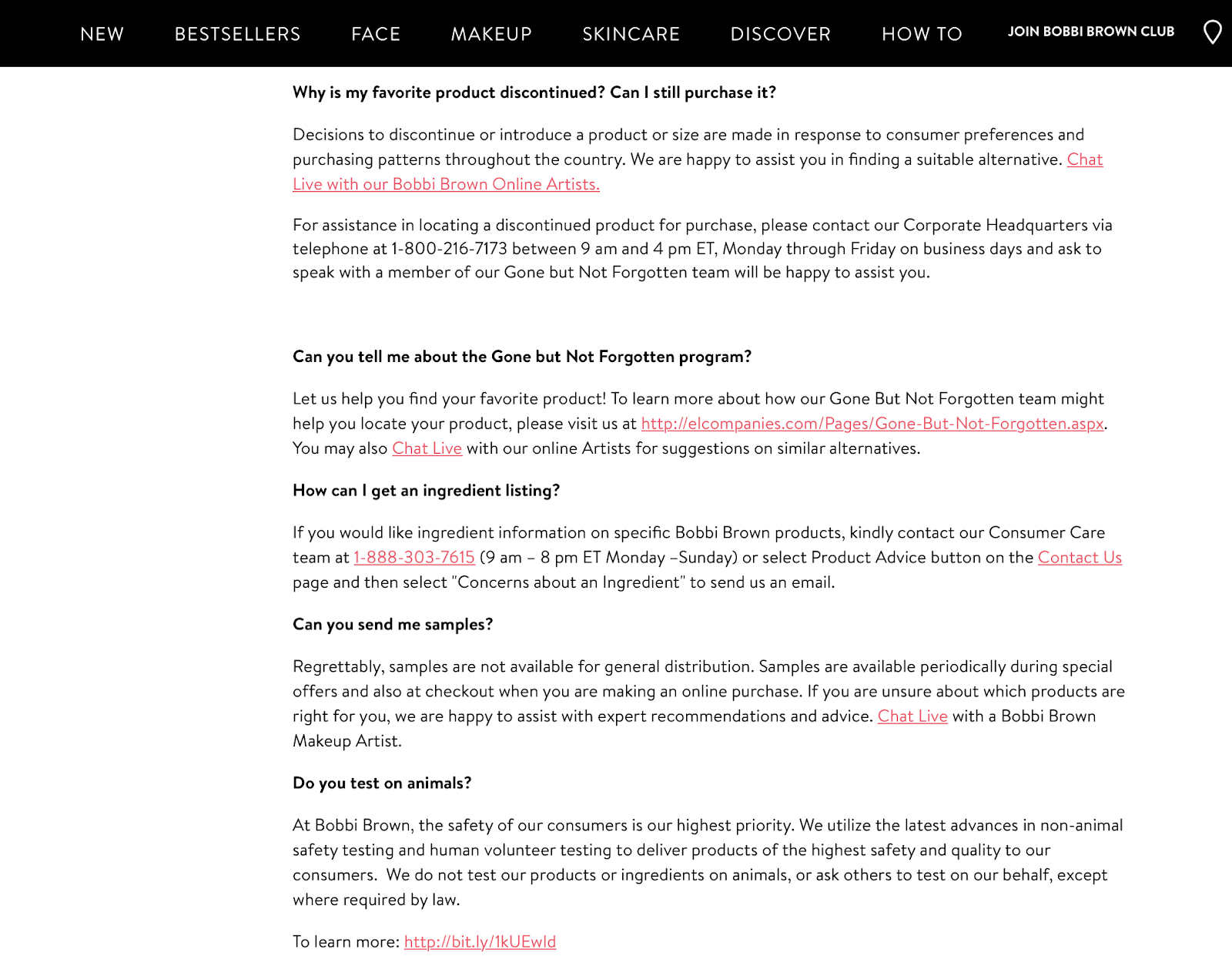
Let’s take cosmetics companies as an example. From experience, most brands who aren’t actively advertising that their brand is cruelty-free and doesn’t test on animals are not cruelty-free and they can’t guarantee that they don’t test on animals. If a consumer wants to know if you’re cruelty-free and it isn’t explicitly mentioned on your FAQ page, they might make assumptions and take their business elsewhere as a result.
Where should you feature your FAQ page?
In many cases, having an easy-to-find FAQ page is integral to your buyer’s journey. That’s why many online merchants Some sites list them in the primary navigation bar as their own distinct page.
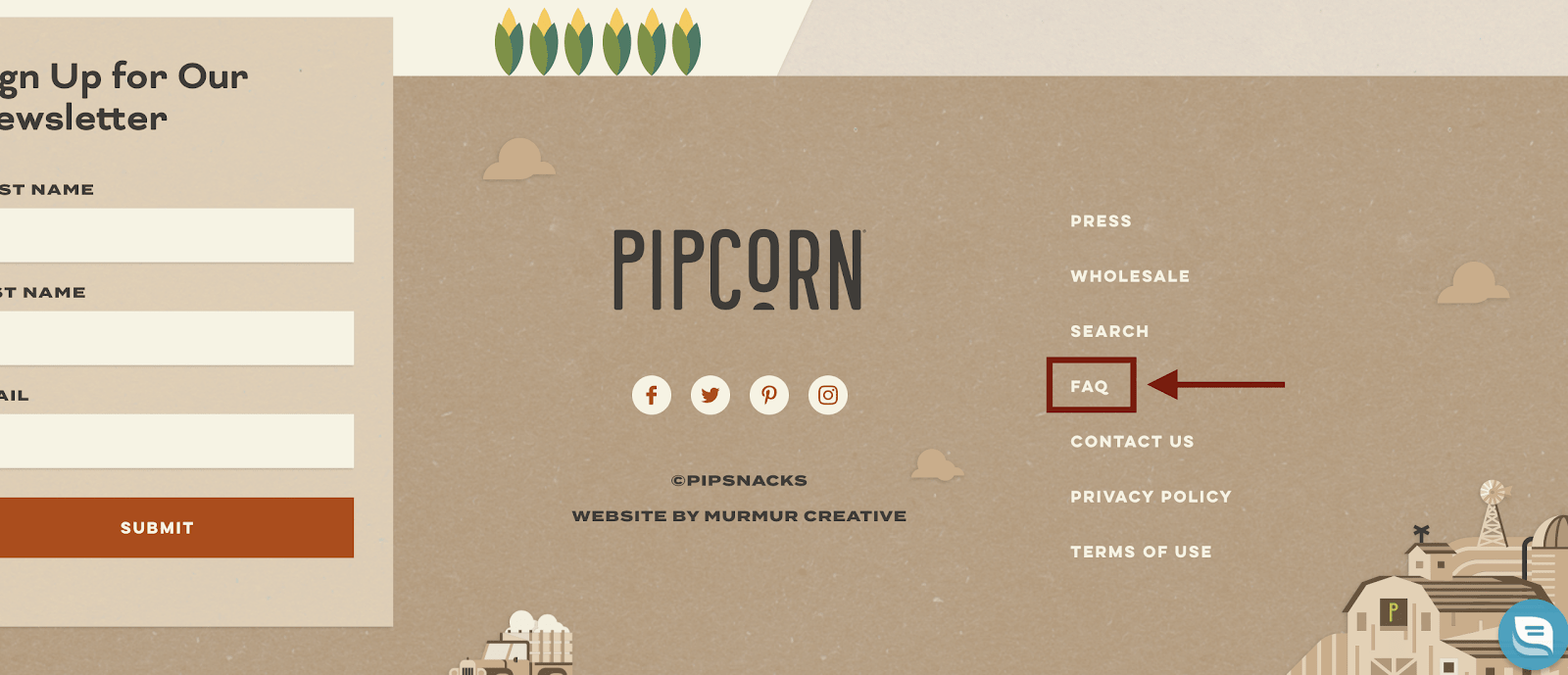
The most popular choice, however, is to list the FAQ page in the footer section of your site. This ensures that it’s always visible and accessible, regardless of where a customer is on your site.
Additionally, most consumers know to look for FAQ pages here. Placing it near the “Contact Us” and “Search” tabs is typically a good choice, like what Pipcorn does in the example above.
How should you answer FAQs?
Answers in your FAQ section should be concise. Think as brief as possible while thoroughly answering each question. At the end of an answer, you can provide a link that will take users to a page with more information if needed.
Let’s say I run an online yoga equipment store. The question is “Are your yoga mats environmentally friendly?”
The answer shouldn’t be a five-paragraph essay or a whole blog post about why your brand practices are sustainable and ethical. Instead, a simple answer like this would work:
“Yes! Environmental protection is an integral part of our company’s mission. All of our mats are made with recycled materials in factories that were designed to minimize energy usage and waste. We also use environmentally-friendly packaging. You can learn more about our mission and our sustainable and green efforts here.”
That link can take users to a full blog post or mission page where you detail every effort you’ve made to be green and sustainable. The answer is quick and thorough but provides access to even more information if wanted or needed.
A standard FAQ page template
When creating your FAQ page, it’s typically best to follow a standard FAQ template.
You always want to title it “FAQ” so that people are able to find it easily via search engines, your website’s search function or from the navigation bar.
If you have 10 or fewer questions, you can list them all together. More than that and it makes sense to break them into sections like “Shipping Questions,” “Product Questions,” and “About Our Brand.” This will keep the page organized and looking clean while also helping people quickly find answers.
Your questions and answers should be easy to read and scan. Typically, bolding the questions and using a larger text and using plain text for the answers is a good choice. Stylistically, this makes it easier to scan the questions.

Tips for building FAQ pages
Let’s take a look at a few key tips and best practices that you’ll want to keep in mind while building your FAQ page:
Look at common FAQ questions other brands are answering
If a lot of other brands in your space are answering the same questions, there’s a good chance that you should answer them, too.
If you’re selling tea sets and infusers online, for example, you may have already answered a question saying that it’s safe to put the cast iron tea kettle on a stove. You might notice, however, that your competitors cover the specifics of gas stoves in addition to electric stoves, and that they have a special section on induction stovetops.
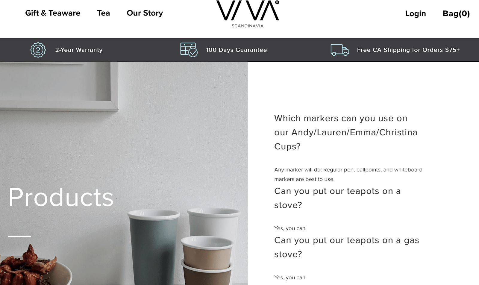
You might get new ideas for questions and answers that can be beneficial to your target audience, which could help you sell even more.
Overcome common customer objections
Before purchasing, potential customers may be using your FAQ section to learn more about the product and brand. They’re looking for information that will overcome concerns and objections, so make sure your FAQ adequately responds to them.
This example from GlobeIn is fantastic. GlobeIn sells themed boxes with beautiful work like hand-painted pottery from artisans all over the world with the aim of providing fair pay to those who need it.
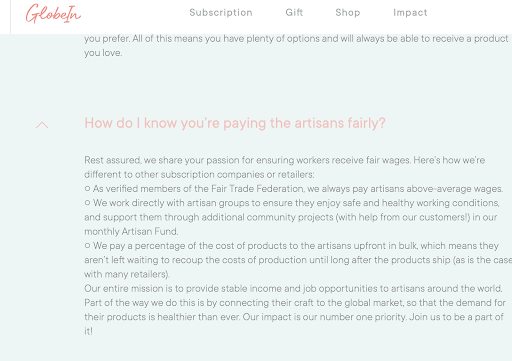
Unfortunately, a lot of companies make promises like this and they don’t actually do any good. It’s natural for a potential customer to think “how do I really know they’re doing what they’re saying?”
GlobeIn used their FAQ section to address this head on, detailing how their brand works and mentioning that they’re verified members of the Fair Trade Federation. This can put customers at ease and help them feel great about their purchase.
Link to the contact page for unanswered questions
No matter how thorough your FAQ page is, there will always be questions that you never thought to answer. You want to make sure that your contact information is readily available when this is the case. Having a link to your contact page, live chat, or even listing your company’s email directly above and/or underneath your FAQ’s list of questions is a good call.
The more accessible it is for customers to get the answers they need, the better. Make it easy for them to do so.
3 FAQ page examples to be inspired by
Let’s take a look at three brands that created a well-rounded, effective FAQ page.
Welly’s FAQ page
Welly sells stainless steel and bamboo water bottles, and their FAQ page is extremely well-done. First, they immediately offer the email address if a customer needs to reach the support.
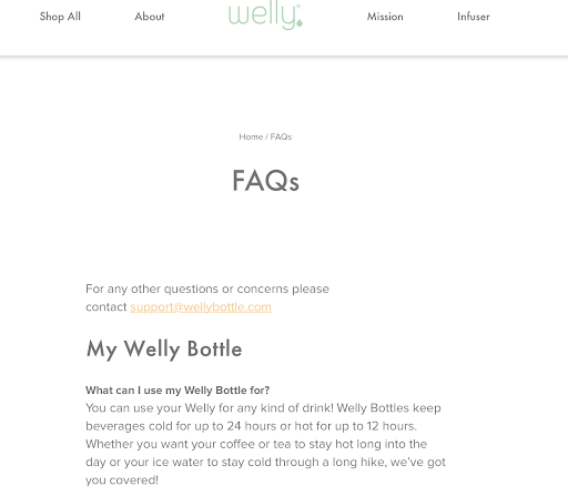
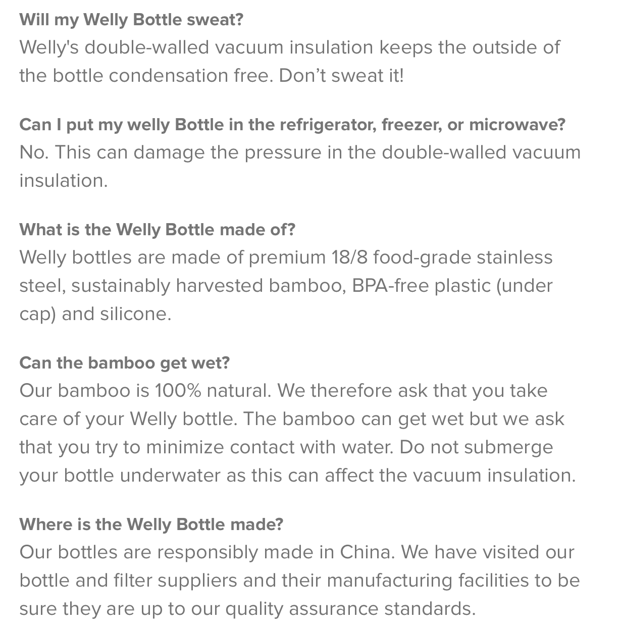
They keep each answer brief, while responding to many questions related to their product, how to care for it and what customers can expect.
Pipcorn’s FAQ page
Pipcorn FAQ page is the ideal that most brands should strive for. They start with clear organization, breaking the FAQ down into sections like “All Products” and “Popcorn” so that users can find the information they need fast.
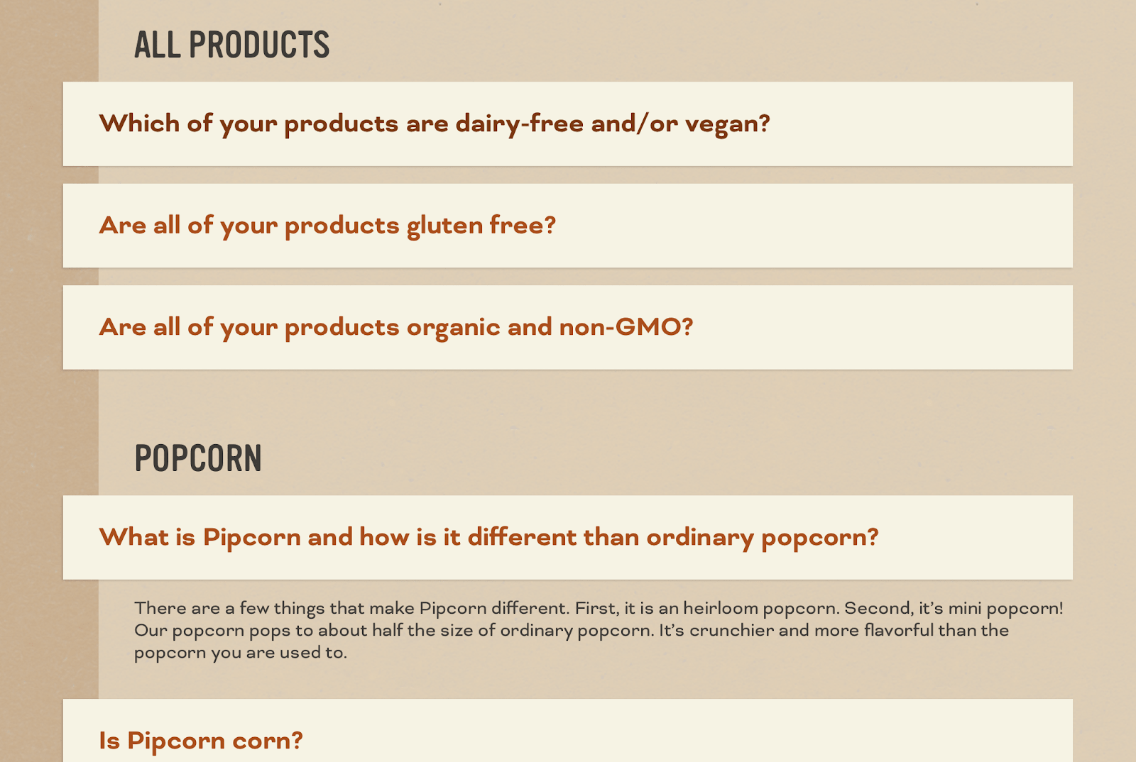
They also use a drop-down widget so that users just have to click on the question to see its answer. This keeps the page easy to read and improves the user experience. They also link to relevant pages and information when it’s beneficial to the customer to do so.
Tattly’s FAQ page
Tattly creates beautiful artistic temporary tattoos and their FAQ page is strong overall. They use a clear and distinct branded voice that adds excitement to the product, with questions like “I can’t wait! How do I put it on?” instead of just “How do I apply the tattoo?” Don’t be afraid to show a little personality with how you respond to questions on your FAQ page.
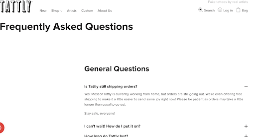
In addition to offering clear instructions, however, they do something exceptionally well that many brands aren’t: They’re updating the FAQ with relevant, time-sensitive questions and answers.
Their first question, for example, reads “Is Tattly still shipping orders?” They immediately address the coronavirus epidemic and its impact on their business, knowing that this is a question that everyone has.
Your turn
An FAQ page offers valuable opportunities to answer customer questions in a way that can drive sales, overcome objections and establish a stronger branded experience.
Even if your FAQ section is short and simple, any online store will benefit from adding one to their site and making it easy for people to find.
It’s also important to update your FAQ page as policies change or as new customer concerns and questions become prevalent.
While an FAQ page can feel like an afterthought, it actually adds a ton of value. An effective FAQ page will help reduce abandoned carts, reduce the burden on your customer support teams and address any customer anxieties head-on. That makes it well worth the effort!
If you use Lightspeed eCom and want to add an FAQ page to your site, visit our support center for a detailed walkthrough.

News you care about. Tips you can use.
Everything your business needs to grow, delivered straight to your inbox.

