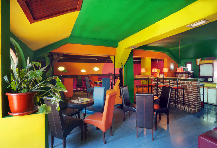
If you’re opening a restaurant, there are some design concepts that should take center stage — and what color to paint your establishment is one of them. Just like when designing your menu, it’s important to remember that color and design may affect customer behavior — and that takes precedence over your favorite color.
Some theories may seem cliched and outdated, but there’s still something to be said about certain colors being simply more appetizing than others. Always ask yourself what you would like your customers to do and how you would want them to feel — and which colors are best for that.
Do you want guests to…
- Stay for a long time, slowly sipping their coffee?
- Eat quickly and leave?
- Have a quiet, romantic evening?
- Drink several pints of beer with occasional sides?
Keep in mind that the following suggestions may change depending on who you’re speaking with — and something else like flag colors for an ethnic restaurant may be the deciding factor — but here are a few consistent ideas that we’ve found.
Why restaurant colors should be the first part of your restaurant design
Color impacts so much more than just aesthetics. People actually have psychological reactions to colors and those reactions can affect everything from whether or not diners come to your restaurant in the first place to how long they stay and how much they order. As Chron explains, “the more effectively a restaurant design utilizes color to establish an image, create ambiance and arouse the customer’s appetites, the greater the chances are for long-term success.”
Rosalin Anderson, the chief branding officer for Just Salad, agrees. She told Business.com that “strategic color is one of the most powerful tools for restaurants to use to convey an enjoyable dining experience. The selection of the right color is very important, as it can make diners feel a wide range of emotions from very energized to relaxed and everything in between.”
The best thing you can do to prepare is to learn more about how color works in general, but also how it works in the restaurant industry specifically. When it comes to space, color can be used to make the space seem bigger or smaller than it really is. Color also goes a long way in defining how intimate the space feels, so right from the get-go you’ve got to be thinking about color.
When picking the colors that will be the basis of your restaurant’s design, keep your brand in mind and don’t be afraid to experiment. While color is hugely important, it won’t completely make or break your business, so there is room for some trial and error as long as you start small. You can begin by introducing elements of color slowly and see how that affects your customers before you fully commit to it as your final, official color scheme.
Blues and purples
We often hear that, subconsciously, blue and purple tones are associated with toxins and have been shown to decrease appetite. Whether or not the association with toxins is true, the fact that there are not many naturally blue and purple foods is used to explain why the color doesn’t evoke hunger in people. Blue is associated more frequently with beverages or relaxation, therefore these tones are usually used in spas or coffee houses with a bohemian feel. As blues are also considered to actually suppress appetite, gyms typically use the color for their design. All of this means that for a restaurant, the best thing to do may be to reconsider shades of blue and purple.
Restaurant color ideas for blues and purples
While its best to avoid blues and purples unless you really know what you’re doing, like with any creative process, the rules can be broken with excellent results. As Rosalin Anderson explains to Business.com, “[Just Salad uses] a saturated navy blue for our logo to further differentiate ourselves from our competitors that use a lot of green.”
One way blues do usually work, though, is in seafood-focused or nautically-themed restaurants have been known to pull off blues. They key is that they’re often very muted and used alongside a lot of neutrals like light beiges and whites.
Overall though, the best way to use a blue or purple is to use it sparingly. If you go for it in your logo design, be thoughtful about how big or prominent your logo is across your restaurant because even a flourish of blue can become too much if that little flourish is repeated over and over again.
Greens
Understandably associated with nature, health food restaurants often use green and Earth tones to draw a connection. The obvious association with nature is also the reason that people generally feel quite relaxed in green rooms and may actually intuitively feel that the food being served is healthy and fresh. Green shades with earth tones create a relaxed atmosphere and encourage patrons to sit down, relax and stay awhile — while possibly continuing to order food or drinks.
Restaurant color ideas for green
Like with warmer colors, if you’re going with green the approach should ideally be a muted, earthy tone that is used on walls and as accent colors with browns and other neutral tones. Keep in mind that green is often used to signify health and nature—according to the Balance, using it “can convey the perception that [your restaurant’s] menu is healthier than its competitors.” An innovative option for green and brown together is adding orange for a fresh, more modern take on earthy greens and browns, but remember that green doesn’t bode well in meat-heavy restaurants so if that’s your niche it’s probably best to avoid it altogether.
Yellows and oranges
Yellows are often seen as irritating or disturbing tones and are actually used by fast food restaurants in order to encourage people to eat quickly and leave. Shades of yellow are important too — yellow-green shades may be more unpleasant in an eating environment than bright yellows. Generally, bright yellows and reds lend themselves well to an energetic vibe, not encouraging people to sit and relax, so the use of this color would depend on the type of atmosphere that you are building.
Restaurant color ideas for yellows and oranges
Yellows and oranges perform best in places like yogurt shops, cafes and other light-hearted and inexpensive options according to the Balance. If you’ve got a breakfast joint, chances are you can make yellows and oranges work for you. However, unless you’re running a very particular nightclub, always avoid neon versions of these colors. Like with most colors, going bold and bright isn’t advised and it’s best to keep them as accents as much as possible.

Reds
Earth tones or rich reds are best for fine dining restaurants, especially when combined with deep wood tones. When overused, however, they can be an irritant, just like yellows. To create a more intimate environment in a larger space such as a banquet hall, dark, profound reds are a good idea. Reds and yellows are often great colors for accessories and accents within a restaurant, adding punch and playfulness to more subdued colors.
Restaurant color ideas for reds
Ashley Anastasia Howell, a graphic designer, lays out color psychology for restaurants and brands on a Medium post she penned in 2016. When it comes to reds, she notes that red tablecloths have actually been found to make customers eat more but she cautions that it needs to be used sparingly. So, if you must use red, tablecloths or other table accents are the places to do it.
White, beige and light neutrals
Light colors such as white, beige and light grays can make a small space look larger and less cramped. They also evoke a more leisurely and relaxed feel, making customers feel welcome to spend time comfortably. Something to remember with white, however, is that it can appear stark and may combine with another wall — for example, a full wall of red — to create the effect of another color. Be aware of what other colors you have in the restaurant before adding any white elements.
Restaurant color ideas for whites and neutrals
Along with beige and light gray, white can make smaller spaces feel roomier and evoke simplicity and sophistication when used in conjunction with black. White can create a leisurely and relaxed atmosphere—or feel stark, depending on how it’s used. Note that the combination of white on one wall with a different color on another wall can create the effect of another color.

Colors can either entice someone to eat or completely turn them off, but the rules aren’t set in stone — some places might go against these guidelines with great success. Identifying which colors, however, are appropriate for your business is an important step to creating the kind of environment you want to create and encourage the kinds of customer behaviors that you would like to see.


News you care about. Tips you can use.
Everything your business needs to grow, delivered straight to your inbox.


