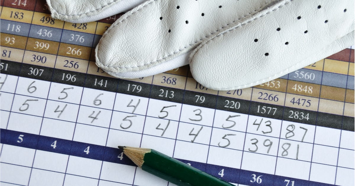
Every golf course has a scorecard, but not every scorecard is created equally.
Some golf courses have very well designed templates that clearly reflect a strong brand image, while others plaster their scorecards with ugly looking advertisements, and useless information that is difficult to understand.
Consider how the scorecard is an integral component of the round; anyone who plays your course will look at it at least 18 times, actively engaging with it as they fill in their scores.
Getting the scorecard right can actually help to both increase the value of your brand and serve as a significant supplementary source of revenue.
What is a golf scorecard?
Scorecards in the game of golf are used to record the number of shots a player takes on each hole. The scorecard also provides useful information about the course and each hole, so the golfer can make informed decisions during the round.
Typically a scorecard will include:
- Hole number
- Par
- Yardage for each tee box
- Handicap
- Pace of play
- Slope and Rating for each set of tees
- Course layout
As well as boxes for the golfer to enter information:
- Fairways in Regulation
- Greens in Regulation
- Number of putts per hole
- Hole Score
Your scorecard should contain space for all of this information while remaining readable and easy to fill in.
Types of Scorecard Designs
Getting all that information into a small scorecard is definitely not easy, it takes some well-considered design thinking to put together something that works really well.
Here’s a few examples of the kinds of scorecards we see at a variety of clubs.
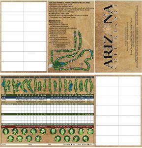
This Arizona Golf Resort scorecard is a great example of a destination resort themed card, with themed fonts and a consistent aesthetic. Also, the area for note taking is always appreciated by more serious golfers who like to record details about their round.
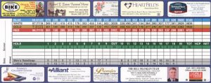
This scorecard features a lot of advertising, and very little space for writing in scores or finding golf related information. Whether or not you find this appealing is up to you, but consider what a scorecard like this says about your brand and your business from a financial stand point.
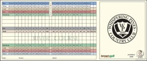
This scorecard from Whispering Pines Country Club is a good example of the minimalist traditional designs we see from private golf clubs.
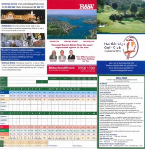
This scorecard from Northbridge tastefully makes use of advertising, while promoting its onsite amenities. This is a great example of a public club score card done very well.
To build the perfect scorecard for your business, it’s best to follow these design principles step by step:
1. Showcase your brand image
Scorecard design starts with understanding your brand image.
Ask yourself, how your golf course presents itself and what words, images, logos, and designs best reflect that.
Whether it’s intentional or not, every golf course presents itself in a unique way.
Some facilities maintain an exclusive, traditional, and serious image. Others are more approachable, family-friendly, and fun. Still, others present a vacation lifestyle that is all about luxury and amenities.
There is no right or wrong way to present your golf course, as long your actual position in the market and quality of your offerings properly reflects your branding.
2. Start with a basis for your design
Once you understand your brand, picking a creative direction for your scorecard gets a lot easier.
A public and family-friendly course might advertise its family restaurant, make use of fun looking fonts and position their level of accessibility with a rule sheet, course map, and contact information.
Destination courses might want to use vacation-themed fonts and showcase their luxury amenities.
A technologically advanced club might want to push its mobile app and other mobile based features.
Private clubs usually stick to a very simple and traditional design that focusses solely on the game, uses classic fonts, with absolutely no advertising.
No matter how your golf course brands itself, pick a creative direction that makes sense for your business and creates the most value.
3. Gridding your scorecard
Whenever you design a scorecard you will have to balance two conflicting elements: information and space.
The goal of your scorecard is to make it as easy as possible for the golfer to fill in while providing as much useful information as possible. To optimize this balance you have to use design to consolidate and clearly present information.
For any scorecard, the most difficult area to do this is on the scoring grid.
One way to save space is by consolidating information on men’s and women’s handicaps and par’s in the same rows using slashes. Traditionally, these rows are kept separate, however, if there is a lot of difference between them, it makes sense to keep them together.
If you use combo tees, consider highlighting the tee boxes in each row for their associated starts, instead of using a full row for the combo start.
The steering wheel clip where the score card will sit in the golf cart is something to take into consideration as well. Usually, the steering wheel clip will take up a quarter-inch of the top of the card, so leave space so as not to cover up the top row.
Whether you choose to grid your scorecard in a landscape or portrait format, your grid should take up the same amount of space.
Just remember that the front and back of the scorecard should be designed according to how the grid is oriented, considering that this is the way the golfer will open the scorecard.
4. Photography and logo designs
Many scorecards make use of photography and logos.
Typically the golf course will put a landscape or portrait photo on the front cover of their scorecard that highlights a special feature about their track. Usually, this special feature is a signature hole or vantage point.
When using a photo for your scorecard here are a few tips to consider:
- Select a picture that highlights a special part of your course
- Find an angle that minimizes unattractive features like cars, construction, or telephone poles
- Use a printable resolution greater than 300dpi for both logos and photography
- Whether you use a landscape or portrait photo make sure its fit in the scorecard is aesthetically pleasing
- If you don’t have any good pictures, don’t be afraid to use your smartphone
It’s worth noting that traditional private club scorecards are often very minimal in design and don’t make use of any images. These scorecards instead make use of the club’s signature logo and branding. For private clubs, the value in their logo is communicated given the history and meaning behind these assets.
5. Should my scorecard make use of a map?
If you operate a public course then the answer is probably yes. These facilities often are host to players who are visiting for the first time and won’t know where they are going or where important amenities are.
If the goal of your map is to reduce confusion on the course and help first-timers navigate around your property, make sure the map is as large as possible. It always helps to include icons for important facilities on your map such as:
- Cart paths
- Holes
- Washrooms
- Halfway houses
- Lightning shelters
- AED devices
- The clubhouse
- Tee boxes
If you run a private or semi-private club your clientele is much more likely to be well acquainted with your golf club and won’t need a map to show them where to go. However, your course still may benefit from putting maps of each individual hole, and green maps if the hole placement changes frequently.
In this case, the maps for each hole should focus on providing information to players to help with shot placement and strategy. These maps usually work best when placed above the scoring grid, and should only depict the layout of the hole itself, complete with hazard, green, bunker, and fairway diagrams.
6. The back panel
Back panel design on scorecards varies from course to course.
Some private clubs leave the panel almost blank or leave space for note-taking.
Public courses, who take in new visitors everyday usually use the back panel to communicate course-related rules and information.
For public clubs, this kind of information is most appropriate on scorecard back panels:
- Course-specific modifications to the rules
- Lightning and rain check policy and procedures
- Information about environmentally sensitive areas
- Cart policies
- Code of conduct
- Legal disclaimers
- Restroom locations
- Effluent water warnings
- Water hazard warnings
- Emergency contact information
Scorecard back panels aren’t very big so make sure that the information shared on the card is absolutely necessary. For example, if your rules follow USGA guidelines, you don’t need to say anything more than that your course follows the USGA Rules of Golf.
7. Ordering your scorecards
Once you have a design that works for your business it’s time to format your scorecard for printing so you can make an order.
Getting the order right is important, you don’t want to receive a final product that isn’t up to par.
To ensure your scorecard order goes smoothly makes sure you:
- Choose the right sizing
- Pick the right card stock
- Send a high-resolution image (300 dpi minimum)
- Economize with large scale orders
Before you make a large order try to get a sample and get a feel for how the final product will look. Some card stocks do better than others in terms of writeability and displaying images.
Typically scorecards work best with thicker coated paper and a slight sheen to make images stick out a little bit better.
However, if you are going for a more traditional and minimal look, you may want to consider using textured matte cardstock.
Once you have a design proof that works for you, your scorecard is ready for the printers. Make a larger order to economize and cut costs. We recommend purchasing enough scorecards to last one season, so you can make updates each year as necessary.
To understand exactly how many to order, look at your past year’s reporting and numbers to understand how many rounds you can expect to come through your course.
Key takeaways and best practices
Scorecards are a very important part of the golf experience. Every golfer that comes through your facility will use one, so it’s critical to make sure you are providing useful and readable high-quality scorecards.
Here are our key best practices to follow when designing your scorecard:
- Establish the value of your brand
- Neatly provide relevant information
- Well-considered and tasteful advertisements
- Use high-resolution images
- Pick a thick and writable card stock
When it comes to scorecard design it is always nice to get a little bit of help, especially if you aren’t well accustomed to using design software.

News you care about. Tips you can use.
Everything your business needs to grow, delivered straight to your inbox.


