Does packaging make or break a product?
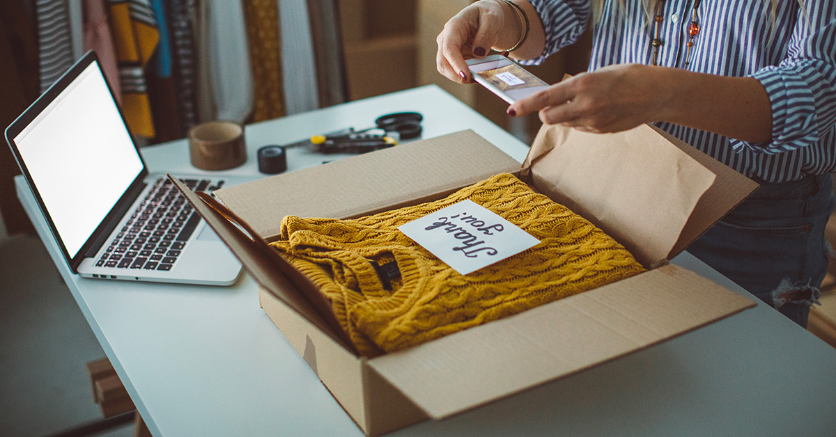
That might sound like a bit of a stretch, but the unboxing experience is a fundamental part of any customer’s ecommerce experience. Content of people unboxing products is shared every day on social media (128 million hits for “unboxing” on Google as of right now). Why? Because everyone appreciates thoughtful design. People want product packaging to be creative. If you exceed those expectations, your unboxing experience will please your customers and amplify brand recognition — it might even go viral.
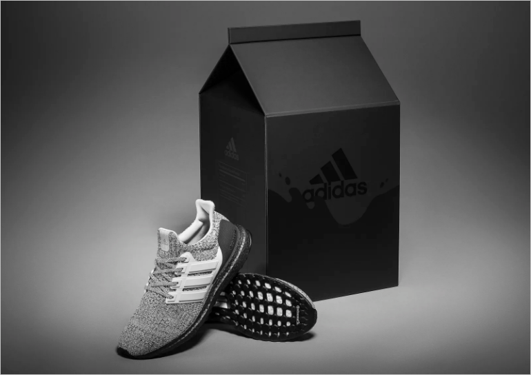
But there are many ways to create an awesome unboxing experience. Just take a look at how Adidas used creative product packaging to differentiate their limited-edition cookies and cream themed shoe by making the shoe’s packaging a milk carton. Keep reading to see other examples of creative product packaging, and breakdowns of why they’re the crème de la crème.
The vibrant minimalist
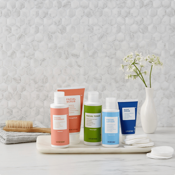
Whoever said minimalism was about lack of detail never laid eyes on Brandless. Their products’ are gluten-free, vegan, and organic, and their packaging is all reusable and recyclable; every detail embodies the company’s philosophy, “just what matters”.
Their unboxing experience begins with a simple, personalized message: thanks for being a part of the Brandless community. Customers find each product carefully wrapped and separated by inserts that protect your breakables from breaking and crushables from getting crushed (how thoughtful of them!). All of this is to support the true star of the show: the product.
Each product’s packaging uses simple typography and vibrant colors. The product’s color often reflects its flavor or scent, while its name is exactly what it is — no more, no less. The consistency between the product’s packaging and the shipment packaging makes for a cohesive experience across each customer touchpoint.
Wrap luxury in luxury
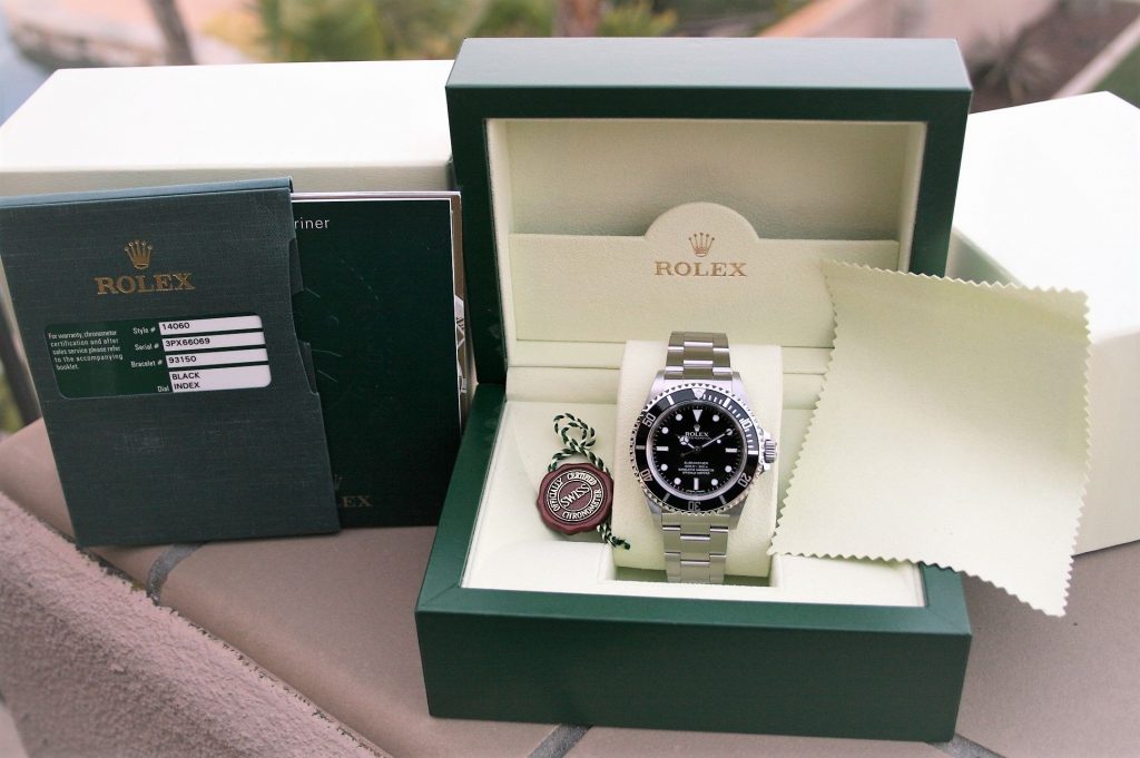
Rolex’s unboxing experience goes all out to make the owner feel the luxury timepiece’s value.
If your $30,000 watch arrived in a simple, no-frills box, you would probably feel let down, but Rolex’s product packaging does an excellent job of matching their customers’ understandably high expectations. For the submariner watch, one of the company’s most popular styles, the watch box uses Rolex’s iconic green color and luxe texture. Once opened, you’ll find the incredible lengths that Rolex has gone to protect your investment — the watch itself is covered in those little peelable clear stickers to protect it from scratches and marks, a plastic bevel cover protects the bevel from damage, and your cleaning cloth is folded carefully over the whole thing. The box is not simply a vessel to transport the product from supplier to the customer; it’s something beautiful that you can store the watch in and display proudly.
Make special editions feel special
For a company like Nike that’s constantly coming out with different colorways and themes for the same shoes, you’d expect that they’d default to one package for all of them, but no. Nike is better than that. Nike wants you to feel like each shoe is unique and it extends that philosophy all the way to the box it comes in.
Even Nike’s mass-released products’ packaging is often enhanced with a pattern, design, or color that reflects the concept of the sneaker itself. This benefits Nike’s brand twofold: it creates added value for the customer and, for sneakerheads, creates a totally unique addition to their collection of boxed shoes.
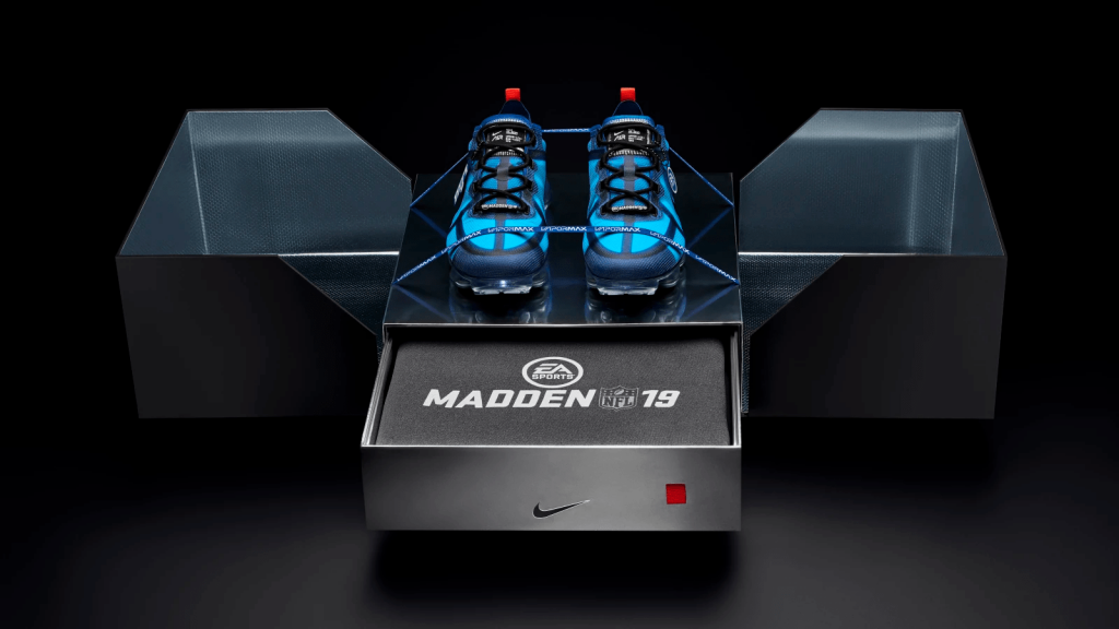
Of course, Nike is also well known for creating thematic product packaging for their limited edition sneakers and big collaborations. Just take their EA Sports Madden 19 Vapormax shoe for example. The customer is treated to a large, black and silver box with two industrial straps buckling it closed. Once popped open, the box unfolds into a shiny silver stage which displays the shoes. There’s even a drawer within the shoe box that contains a limited edition sweatshirt. The whole unboxing experience is fun, clever, and totally plays on the theme of video games and football.
Simple success (No B.S.)
Lovers of the quirky, simple, and informative packaging of RXBARs might gasp in horror upon seeing the original packaging. Yikes. Thankfully, their new packaging swooped in and transformed RXBAR into the company we all know, love, and recognize in the protein bar aisle — a dramatic change from the original design. So, why does it work?
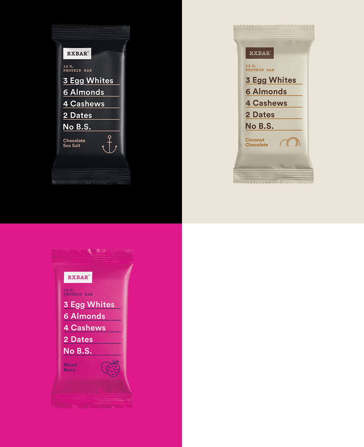
Similar to Brandless, RXBAR is all about simple and straightforward, evidenced in their “No B.S.” tagline. They knew the labels their bars claim (vegan, non-GMO, gluten-free) didn’t set them apart from every other protein bar out there. What did set them apart was their No B.S. distillation of what was in their bars: 3 egg whites, 6 almonds, 4 cashews, and 2 dates.
They decided to showcase their ingredients for their packaging strategy, and boy, did it work. To complement (but not distract) from the list of ingredients, each bar’s packaging uses a contrasting color palette, the RXBAR logo, and an icon that reflects the bar’s flavor. Their “no B.S.” tagline follows through from their ingredients to their packaging — cohesive branding at its finest.
The dynamic marriage of photography and packaging
Sure, Google has the product packaging budget of your dreams, but you don’t need a big budget to use the same principles they did. For its packaging redesign last year, Google chose to focus on product photography. They also made use of contrasting and on-brand colors to make the packaging pop.
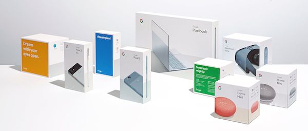
It’s once you open the box that you see the attention that Google paid to their customer’s journey. Each accessory is placed in the box in the same order that a user would typically use them in. The result is a natural unboxing sequence. It needs to reflect how their customers’ will use each component — from charging cable and adapter, to the product itself.
Unbox your brand’s potential
Putting so much effort into the concept of your product’s packaging and unboxing experience might feel a little excessive at first. It’s a lot of time and resources, but in the end, it helps create a memorable experience for your customers. Going the extra mile with your packaging can help you really drive home your brand’s values, philosophy, and mission, whatever they may be.
Get the tools to help you build your brand
See how Lightspeed Retail POS will help you tell your brand's story

News you care about. Tips you can use.
Everything your business needs to grow, delivered straight to your inbox.


